
Redesigning a smart home task for WearOS with a focus on creating fun and functional microinteractions.

Jun 19, 2025
To kick-off the second Interaction Design Studio class, we dove into one of my personal favorite aspects of digital design—microinteractions. As a motion design enthusiast, creating small moments of delight that stem from a single action makes for some of the most exciting steps in my design process. And so, coinciding with two weeks of learning the ins-and-outs of microinteractions that we were tasked with creating our own microinteractions for a task on a smartwatch platform within four weeks. I decided to look at how I could make one of my most used tasks for my smart home set up (configuring my lights) manageable from a WearOS device.
I conducted research that explored two facets: The Google Home experience on mobile & WearOS, and how WearOS users liked to interact with their devices.
For this part of research, I first looked at the app on my phone and documented its UX flow for configuring smart lights. To see it done on a WearOS device, I referred to Youtube tutorials for installing and using Google Home (the most helpful was THIS ONE). By recording the similarities and differences between platforms, I began to get greater clarity regarding what features were required, and how they could be made more delightful.


Things really started to get even more fun once I was able to discern how users navigate their WearOS devices. The default gestures for software was tapping and swiping; however, both Samsung's Galaxy Watches, and Google's Pixel Watches utilized added functionality either in the bezel (physically like in the GIF above, and digitally like in THIS VIDEO) or a scroll wheel on the side. As a former Galaxy Watch owner, I losing using my digital bezel feature, and am still hoping that the physical one makes a return in the next Classic iteration of watches (for which I am not alone! LINK, LINK, LINK); nonetheless, I thought that there should be considerations made for alternate methods of scrolling than just swiping, especially when considering that smartwatches are in and of themselves sometimes standalone devices for some users who want to forego a phone at times. Bearing these discoveries in mind, I started to come up with my how might we question.
Adjust smart lights brightness in a satisfying way, while also not losing color changing capabilities?

My design directions branched into three paths, which looked at tapping, swiping, and a combination of both. I really wanted to better understand how we could move away a bit from the bento box style of the mobile experience, while keeping the iconography and other components intact for WearOS styling, and also maintaining a streamlined flow of actions that feels intuitive.
Drawing inspiration from the physical/digital bezel and physical scroll wheel, I wanted to see how the adjustment of brightness and choosing light color/temp could feel right at home with those more tactile interactions. I originally leaned more towards the fine scrubbing direction, but backed away from it after gaining feedback concerning usability for users that might not have those same product features. Controlling sliders that increment in the single digits with your finger on a small screen could be quite difficult, especially so for people with large hands. Another note that I received, particularly concerning the swipe & toggle and toggle-only direction, was that there were way too many UI components to work on a small screen like on a smart watch.
Feedback in hand, I decided to pursue the swipe & toggle direction but reconfigure it so that it wasn't too busy and too exclusive.

Implementing Google Home Routines into the lighting configuration as a shortcut felt like a no brainer in regards to bringing features forward, and the default routines that I went with were simple day/night color and brightness setups.


One of the best bits of feedback that I got for this project was to change the brightness slider from an overly precise single-digit slider, to something in a different increment. I chose to go by ten instead, which still allows for freedom of customization options, while allowing for a higher tolerance for error.

By moving the color/temp picker away from the edges, I was able to avoid mis-taps and give the screen a little more breathing room. A satisfying solution for one of my most used functions for room ambiance.


To experience the digital product for yourself, please enjoy clicking through the prototype below!
We draw the track as a polyline (sampled points) and orient all glyphs by rotating to the tangent (rotate(p.ang)).
// Parametric curve + tangent
x = a * sin(t),  y = (b/2) * sin(2t)

function infinityPoint(tau, a, b) {
  const x = a * sin(tau);
  const y = (b * 0.5) * sin(2 * tau);
  const dx = a * cos(tau);
  const dy = b * cos(2 * tau);
  const ang = atan2(dy, dx); // tangent angle
  return { x, y, ang };
}
Seasons = Turtle feeding cycles
Fin Strokes = Distance Measuring
Breath = Religious Timing/Calendar
Blink = Day/Night Cycle
// Parametric curve + tangent
x = a * sin(t),  y = (b/2) * sin(2t)

function infinityPoint(tau, a, b) {
  const x = a * sin(tau);
  const y = (b * 0.5) * sin(2 * tau);
  const dx = a * cos(tau);
  const dy = b * cos(2 * tau);
  const ang = atan2(dy, dx); // tangent angle
  return { x, y, ang };
}
Track Color Season color slowly shifts via four stops using seasonalHue() and wrap-aware lerpHue()
const seasonHue = seasonalHue(seasonCyc); // amber → green → violet → cyan
stroke(seasonHue, …); drawInfinityPolyline(...);
Track Color: Season color slowly shifts via four stops using seasonalHue() and wrap-aware lerpHue()
const seasonHue = seasonalHue(seasonCyc); // amber → green → violet → cyan
stroke(seasonHue, …); drawInfinityPolyline(...);
An image of MF DOOM's iconic mask is divided into a grid of tiles. When a button is pressed, random hidden tiles are revealed, and newly revealed tiles briefly glow in response to the sound.
revealed[r][c] = true;This project sits somewhere between an instrument, a game, and a piece of interactive visual art.
It asks a simple question:
What if making music wasn’t about building something new — but revealing something that already exists?
By tying sound, touch, and imagery together, the machine transforms rhythm into progress.
Sometimes, the beat isn’t the point. Sometimes, the beat is the key.
Redesigning a smart home task for WearOS with a focus on creating fun and functional microinteractions.
Jun 19, 2025
To kick-off the second Interaction Design Studio class, we dove into one of my personal favorite aspects of digital design—microinteractions. As a motion design enthusiast, creating small moments of delight that stem from a single action makes for some of the most exciting steps in my design process. And so, coinciding with two weeks of learning the ins-and-outs of microinteractions that we were tasked with creating our own microinteractions for a task on a smartwatch platform within four weeks. I decided to look at how I could make one of my most used tasks for my smart home set up (configuring my lights) manageable from a WearOS device.
I conducted research that explored two facets: The Google Home experience on mobile & WearOS, and how WearOS users liked to interact with their devices.
For this part of research, I first looked at the app on my phone and documented its UX flow for configuring smart lights. To see it done on a WearOS device, I referred to Youtube tutorials for installing and using Google Home (the most helpful was THIS ONE). By recording the similarities and differences between platforms, I began to get greater clarity regarding what features were required, and how they could be made more delightful.
Things really started to get even more fun once I was able to discern how users navigate their WearOS devices. The default gestures for software was tapping and swiping; however, both Samsung's Galaxy Watches, and Google's Pixel Watches utilized added functionality either in the bezel (physically like in the GIF above, and digitally like in THIS VIDEO) or a scroll wheel on the side. As a former Galaxy Watch owner, I losing using my digital bezel feature, and am still hoping that the physical one makes a return in the next Classic iteration of watches (for which I am not alone! LINK, LINK, LINK); nonetheless, I thought that there should be considerations made for alternate methods of scrolling than just swiping, especially when considering that smartwatches are in and of themselves sometimes standalone devices for some users who want to forego a phone at times. Bearing these discoveries in mind, I started to come up with my how might we question.
Adjust smart lights brightness in a satisfying way, while also not losing color changing capabilities?
My design directions branched into three paths, which looked at tapping, swiping, and a combination of both. I really wanted to better understand how we could move away a bit from the bento box style of the mobile experience, while keeping the iconography and other components intact for WearOS styling, and also maintaining a streamlined flow of actions that feels intuitive.
Drawing inspiration from the physical/digital bezel and physical scroll wheel, I wanted to see how the adjustment of brightness and choosing light color/temp could feel right at home with those more tactile interactions. I originally leaned more towards the fine scrubbing direction, but backed away from it after gaining feedback concerning usability for users that might not have those same product features. Controlling sliders that increment in the single digits with your finger on a small screen could be quite difficult, especially so for people with large hands. Another note that I received, particularly concerning the swipe & toggle and toggle-only direction, was that there were way too many UI components to work on a small screen like on a smart watch.
Feedback in hand, I decided to pursue the swipe & toggle direction but reconfigure it so that it wasn't too busy and too exclusive.
Implementing Google Home Routines into the lighting configuration as a shortcut felt like a no brainer in regards to bringing features forward, and the default routines that I went with were simple day/night color and brightness setups.
One of the best bits of feedback that I got for this project was to change the brightness slider from an overly precise single-digit slider, to something in a different increment. I chose to go by ten instead, which still allows for freedom of customization options, while allowing for a higher tolerance for error.
By moving the color/temp picker away from the edges, I was able to avoid mis-taps and give the screen a little more breathing room. A satisfying solution for one of my most used functions for room ambiance.
To experience the digital product for yourself, please enjoy clicking through the prototype below!
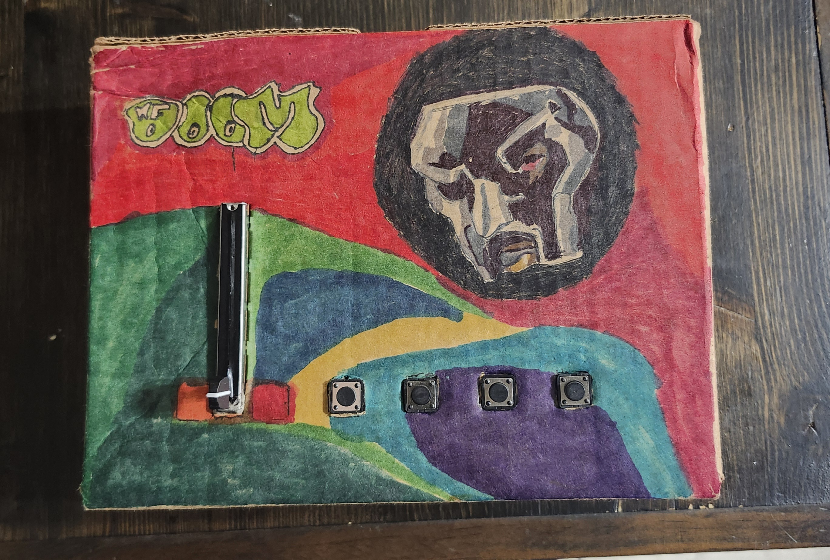
At the heart of the system is a custom-built controller powered by an Arduino ESP32 Feather housed in a cardboard enclosure.
The interface includes:
.jpg)
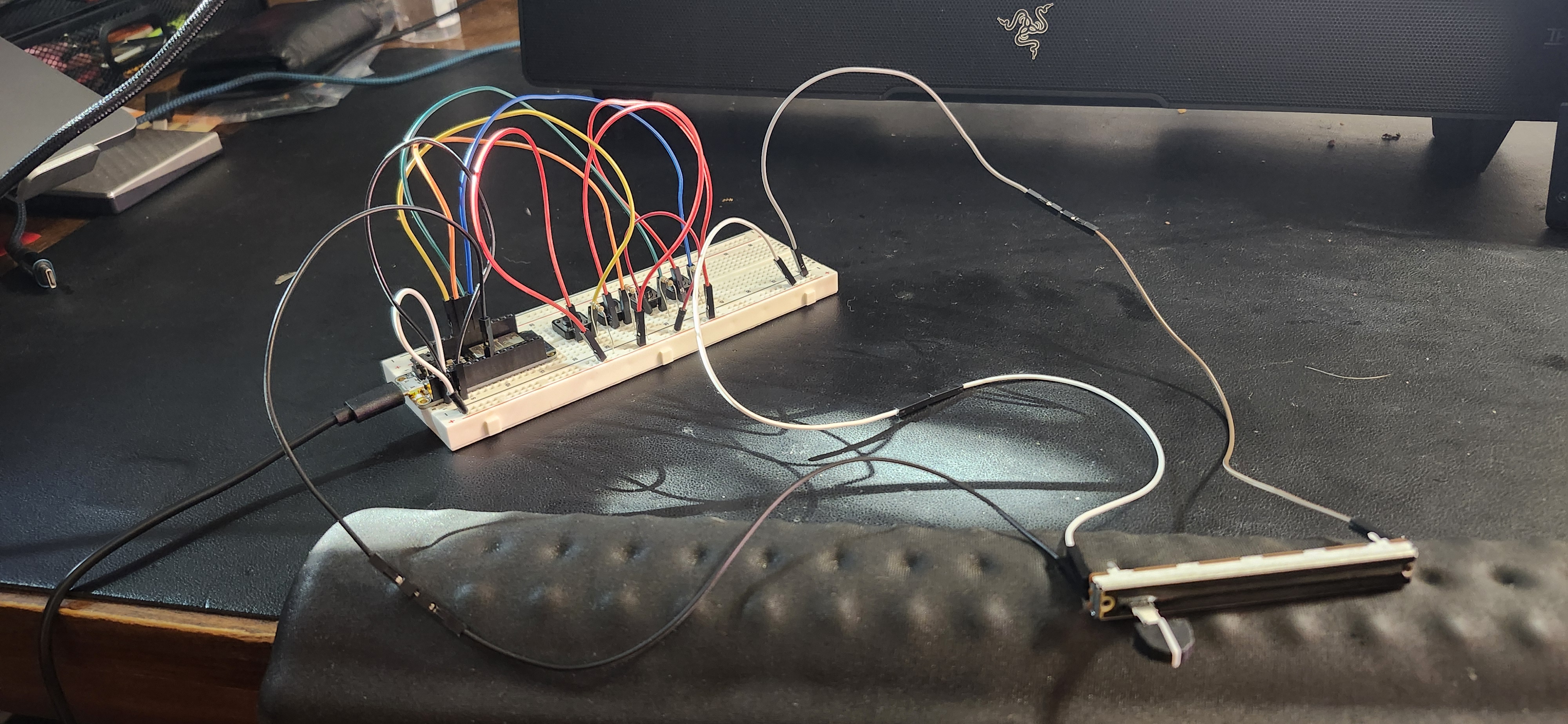
On the hardware side, the ESP32 reads four buttons and a B10K slide potentiometer. Each loop, it sends their values as a single line of comma-separated data over USB serial.
#define B1 13
#define B2 12
#define B3 27
#define B4 33
#define POT_PIN 32

void loop() {
  Serial.print(digitalRead(B1));
  Serial.print(',');
  Serial.print(digitalRead(B2));
  Serial.print(',');
  Serial.print(digitalRead(B3));
  Serial.print(',');
  Serial.print(digitalRead(B4));
  Serial.print(',');
  Serial.println(analogRead(POT_PIN));
}
In Processing, serial data is parsed and mapped to musical behavior. Each button triggers a drum sample, while the slider controls pitch by adjusting playback rate.
pitchRate = map(potRaw, 0, 4095, 0.5, 2.0);
pitchRate = constrain(pitchRate, 0.5, 2.0);

drums[i].rate(pitchRate);
drums[i].play();
An image of MF DOOM's iconic mask is divided into a grid of tiles. When a button is pressed, random hidden tiles are revealed, and newly revealed tiles briefly glow in response to the sound.
revealed[r][c] = true;On the hardware side, the ESP32 reads four buttons and a B10K slide potentiometer. Each loop, it sends their values as a single line of comma-separated data over USB serial.
#define B1 13
#define B2 12
#define B3 27
#define B4 33
#define POT_PIN 32

void loop() {
  Serial.print(digitalRead(B1));
  Serial.print(',');
  Serial.print(digitalRead(B2));
  Serial.print(',');
  Serial.print(digitalRead(B3));
  Serial.print(',');
  Serial.print(digitalRead(B4));
  Serial.print(',');
  Serial.println(analogRead(POT_PIN));
}
This project sits somewhere between an instrument, a game, and a piece of interactive visual art.
It asks a simple question:
What if making music wasn’t about building something new — but revealing something that already exists?
By tying sound, touch, and imagery together, the machine transforms rhythm into progress.
Sometimes, the beat isn’t the point. Sometimes, the beat is the key.
Redesigning a smart home task for WearOS with a focus on creating fun and functional microinteractions.
Jun 19, 2025
To kick-off the second Interaction Design Studio class, we dove into one of my personal favorite aspects of digital design—microinteractions. As a motion design enthusiast, creating small moments of delight that stem from a single action makes for some of the most exciting steps in my design process. And so, coinciding with two weeks of learning the ins-and-outs of microinteractions that we were tasked with creating our own microinteractions for a task on a smartwatch platform within four weeks. I decided to look at how I could make one of my most used tasks for my smart home set up (configuring my lights) manageable from a WearOS device.
I conducted research that explored two facets: The Google Home experience on mobile & WearOS, and how WearOS users liked to interact with their devices.
For this part of research, I first looked at the app on my phone and documented its UX flow for configuring smart lights. To see it done on a WearOS device, I referred to Youtube tutorials for installing and using Google Home (the most helpful was THIS ONE). By recording the similarities and differences between platforms, I began to get greater clarity regarding what features were required, and how they could be made more delightful.
Things really started to get even more fun once I was able to discern how users navigate their WearOS devices. The default gestures for software was tapping and swiping; however, both Samsung's Galaxy Watches, and Google's Pixel Watches utilized added functionality either in the bezel (physically like in the GIF above, and digitally like in THIS VIDEO) or a scroll wheel on the side. As a former Galaxy Watch owner, I losing using my digital bezel feature, and am still hoping that the physical one makes a return in the next Classic iteration of watches (for which I am not alone! LINK, LINK, LINK); nonetheless, I thought that there should be considerations made for alternate methods of scrolling than just swiping, especially when considering that smartwatches are in and of themselves sometimes standalone devices for some users who want to forego a phone at times. Bearing these discoveries in mind, I started to come up with my how might we question.
Adjust smart lights brightness in a satisfying way, while also not losing color changing capabilities?
My design directions branched into three paths, which looked at tapping, swiping, and a combination of both. I really wanted to better understand how we could move away a bit from the bento box style of the mobile experience, while keeping the iconography and other components intact for WearOS styling, and also maintaining a streamlined flow of actions that feels intuitive.
Drawing inspiration from the physical/digital bezel and physical scroll wheel, I wanted to see how the adjustment of brightness and choosing light color/temp could feel right at home with those more tactile interactions. I originally leaned more towards the fine scrubbing direction, but backed away from it after gaining feedback concerning usability for users that might not have those same product features. Controlling sliders that increment in the single digits with your finger on a small screen could be quite difficult, especially so for people with large hands. Another note that I received, particularly concerning the swipe & toggle and toggle-only direction, was that there were way too many UI components to work on a small screen like on a smart watch.
Feedback in hand, I decided to pursue the swipe & toggle direction but reconfigure it so that it wasn't too busy and too exclusive.
Implementing Google Home Routines into the lighting configuration as a shortcut felt like a no brainer in regards to bringing features forward, and the default routines that I went with were simple day/night color and brightness setups.
One of the best bits of feedback that I got for this project was to change the brightness slider from an overly precise single-digit slider, to something in a different increment. I chose to go by ten instead, which still allows for freedom of customization options, while allowing for a higher tolerance for error.
By moving the color/temp picker away from the edges, I was able to avoid mis-taps and give the screen a little more breathing room. A satisfying solution for one of my most used functions for room ambiance.
To experience the digital product for yourself, please enjoy clicking through the prototype below!
At the heart of the system is a custom-built controller powered by an Arduino ESP32 Feather housed in a cardboard enclosure.
The interface includes:
This project sits somewhere between an instrument, a game, and a piece of interactive visual art.
It asks a simple question:
What if making music wasn’t about building something new — but revealing something that already exists?
By tying sound, touch, and imagery together, the machine transforms rhythm into progress.
Sometimes, the beat isn’t the point. Sometimes, the beat is the key.
Redesigning a smart home task for WearOS with a focus on creating fun and functional microinteractions.
Jun 19, 2025
To kick-off the second Interaction Design Studio class, we dove into one of my personal favorite aspects of digital design—microinteractions. As a motion design enthusiast, creating small moments of delight that stem from a single action makes for some of the most exciting steps in my design process. And so, coinciding with two weeks of learning the ins-and-outs of microinteractions that we were tasked with creating our own microinteractions for a task on a smartwatch platform within four weeks. I decided to look at how I could make one of my most used tasks for my smart home set up (configuring my lights) manageable from a WearOS device.
I conducted research that explored two facets: The Google Home experience on mobile & WearOS, and how WearOS users liked to interact with their devices.
For this part of research, I first looked at the app on my phone and documented its UX flow for configuring smart lights. To see it done on a WearOS device, I referred to Youtube tutorials for installing and using Google Home (the most helpful was THIS ONE). By recording the similarities and differences between platforms, I began to get greater clarity regarding what features were required, and how they could be made more delightful.
Things really started to get even more fun once I was able to discern how users navigate their WearOS devices. The default gestures for software was tapping and swiping; however, both Samsung's Galaxy Watches, and Google's Pixel Watches utilized added functionality either in the bezel (physically like in the GIF above, and digitally like in THIS VIDEO) or a scroll wheel on the side. As a former Galaxy Watch owner, I losing using my digital bezel feature, and am still hoping that the physical one makes a return in the next Classic iteration of watches (for which I am not alone! LINK, LINK, LINK); nonetheless, I thought that there should be considerations made for alternate methods of scrolling than just swiping, especially when considering that smartwatches are in and of themselves sometimes standalone devices for some users who want to forego a phone at times. Bearing these discoveries in mind, I started to come up with my how might we question.
Adjust smart lights brightness in a satisfying way, while also not losing color changing capabilities?
My design directions branched into three paths, which looked at tapping, swiping, and a combination of both. I really wanted to better understand how we could move away a bit from the bento box style of the mobile experience, while keeping the iconography and other components intact for WearOS styling, and also maintaining a streamlined flow of actions that feels intuitive.
Drawing inspiration from the physical/digital bezel and physical scroll wheel, I wanted to see how the adjustment of brightness and choosing light color/temp could feel right at home with those more tactile interactions. I originally leaned more towards the fine scrubbing direction, but backed away from it after gaining feedback concerning usability for users that might not have those same product features. Controlling sliders that increment in the single digits with your finger on a small screen could be quite difficult, especially so for people with large hands. Another note that I received, particularly concerning the swipe & toggle and toggle-only direction, was that there were way too many UI components to work on a small screen like on a smart watch.
Feedback in hand, I decided to pursue the swipe & toggle direction but reconfigure it so that it wasn't too busy and too exclusive.
Implementing Google Home Routines into the lighting configuration as a shortcut felt like a no brainer in regards to bringing features forward, and the default routines that I went with were simple day/night color and brightness setups.
One of the best bits of feedback that I got for this project was to change the brightness slider from an overly precise single-digit slider, to something in a different increment. I chose to go by ten instead, which still allows for freedom of customization options, while allowing for a higher tolerance for error.
By moving the color/temp picker away from the edges, I was able to avoid mis-taps and give the screen a little more breathing room. A satisfying solution for one of my most used functions for room ambiance.
To experience the digital product for yourself, please enjoy clicking through the prototype below!
Hydro – tile grids for water, target, age, barren; column arrays for velCol, noiseColForest – 2D fields for willow and aspen (0–1). Growth moves toward a cap reduced by barren; blocked under lodges; harvest() does a ring search for richest patch.DamSpans – spans are {row, cL, cR, integrity} across a gap bounded by land. Integrity decays with time and high flow; collapsed spans are removed.Colony, Beaver – array of agents; mortality filter; metrics; per-beaver FSM with vector steering.Lodge – simple sprite; count tied to populationWhy this order: environment first, then resources, then structures that shape flow, then agents reacting to the current state.
Creates subsystems and enforces the following update order (water → resources → structures → agents).
class World {
  constructor(hud){
    this.hud=hud;
    this.hydro=new Hydro(hud);
    this.forest=new Forest(hud,this.hydro);
    this.dams=new DamSpans(hud,this.hydro);
    this.colony=new Colony(hud,this.hydro,this.dams,this.forest);
    this.lodges=[]; this.updateLodges(true);
  }
  update(){
    this.hydro.update();                     // rivers grow/branch/widen/dry
    this.forest.update(this.lodges,this.hydro); // growth capped by barren
    this.dams.update(this.hydro);            // span decay vs flow
    this.colony.update(this.dams,this.hydro);    // FSM + mortality
    if (this.colony.prunedThisTick){ this.updateLodges(); this.colony.prunedThisTick=false; }
    this.forest.blockUnderLodges(this.lodges,this.hydro);
  }
}The simulation starts with building a target river tree (trunk + noisy branches), reveals it over time (slider), then keep it alive with estuaries, widening, and right-side desiccation.
Beavers “feel” water via noiseCol[c] (stress driver).
regen(){
  this.water=grid(false); this.target=grid(false); this.barren=grid(0); this.growth=0;
  const trunk = walkBranch(2, rows*0.5, cols*0.85, 0, true); paintPath(trunk,5);
  for (let i=0;i<10;i++){ const pC=rand(6,cols*0.7), pR=clamp(noise(i*.3)*rows,2,rows-3);
    paintPath(walkBranch(pC,pR,rand(18,48), coin()?-1:+1,false),3);
  }
}
update(){
  // reveal target → water
  this.growth=min(1,(this.growth||0)+(0.002+hud.get("riverSpeed")*0.02));
  for (let c=0;c<floor(cols*this.growth);c++) for (let r=0;r<rows;r++) if (target[c][r]) water[c][r]=true;

  // desiccate far right → barren land
  for (let c=floor(cols*.75); c<cols; c++) if (random()<0.0008)
    for (let r=0;r<rows;r++) if (water[c][r]){ water[c][r]=target[c][r]=false; barren[c][r]=min(1,barren[c][r]+.4); }

  // estuaries & widening (if undammed & old)
  if (++branchTimer>240){ branchTimer=0; /* spawn small branch from wet pivot; paintPath(...,2) */ }
  // …age water; leak to neighbors when age>180 && !damSpans.hasDamNear(c,r,4)

  recalcColumns(); // sets velCol[], noiseCol[] from wet fraction per column
}
Willows (for building dams) and Aspen (food for the beavers) grow on land toward a cap that shrinks with barren; growth is blocked under lodges and zeroed on water.The simulation starts with building a target river tree (trunk + noisy branches), reveals it over time (slider), then keep it alive with estuaries, widening, and right-side desiccation.
Resulting effects: near water → fertile patches; dry right side → patchy, low-cap growth.
regen(){
  this.water=grid(false); this.target=grid(false); this.barren=grid(0); this.growth=0;
  const trunk = walkBranch(2, rows*0.5, cols*0.85, 0, true); paintPath(trunk,5);
  for (let i=0;i<10;i++){ const pC=rand(6,cols*0.7), pR=clamp(noise(i*.3)*rows,2,rows-3);
    paintPath(walkBranch(pC,pR,rand(18,48), coin()?-1:+1,false),3);
  }
}
update(){
  // reveal target → water
  this.growth=min(1,(this.growth||0)+(0.002+hud.get("riverSpeed")*0.02));
  for (let c=0;c<floor(cols*this.growth);c++) for (let r=0;r<rows;r++) if (target[c][r]) water[c][r]=true;

  // desiccate far right → barren land
  for (let c=floor(cols*.75); c<cols; c++) if (random()<0.0008)
    for (let r=0;r<rows;r++) if (water[c][r]){ water[c][r]=target[c][r]=false; barren[c][r]=min(1,barren[c][r]+.4); }

  // estuaries & widening (if undammed & old)
  if (++branchTimer>240){ branchTimer=0; /* spawn small branch from wet pivot; paintPath(...,2) */ }
  // …age water; leak to neighbors when age>180 && !damSpans.hasDamNear(c,r,4)

  recalcColumns(); // sets velCol[], noiseCol[] from wet fraction per column
}
Dam Spans exist only across contiguous water segments bounded by land; integrity increases with work and decays with flow.
This prevents the beavers from spam building, and makes dams visually & mechanically legible.
regen(){
  this.water=grid(false); this.target=grid(false); this.barren=grid(0); this.growth=0;
  const trunk = walkBranch(2, rows*0.5, cols*0.85, 0, true); paintPath(trunk,5);
  for (let i=0;i<10;i++){ const pC=rand(6,cols*0.7), pR=clamp(noise(i*.3)*rows,2,rows-3);
    paintPath(walkBranch(pC,pR,rand(18,48), coin()?-1:+1,false),3);
  }
}
update(){
  // reveal target → water
  this.growth=min(1,(this.growth||0)+(0.002+hud.get("riverSpeed")*0.02));
  for (let c=0;c<floor(cols*this.growth);c++) for (let r=0;r<rows;r++) if (target[c][r]) water[c][r]=true;

  // desiccate far right → barren land
  for (let c=floor(cols*.75); c<cols; c++) if (random()<0.0008)
    for (let r=0;r<rows;r++) if (water[c][r]){ water[c][r]=target[c][r]=false; barren[c][r]=min(1,barren[c][r]+.4); }

  // estuaries & widening (if undammed & old)
  if (++branchTimer>240){ branchTimer=0; /* spawn small branch from wet pivot; paintPath(...,2) */ }
  // …age water; leak to neighbors when age>180 && !damSpans.hasDamNear(c,r,4)

  recalcColumns(); // sets velCol[], noiseCol[] from wet fraction per column
}
Beavers are need-driven agents with vector steering.
Input from the right-side menu allows the user to shape conditions.
regen(){
  this.water=grid(false); this.target=grid(false); this.barren=grid(0); this.growth=0;
  const trunk = walkBranch(2, rows*0.5, cols*0.85, 0, true); paintPath(trunk,5);
  for (let i=0;i<10;i++){ const pC=rand(6,cols*0.7), pR=clamp(noise(i*.3)*rows,2,rows-3);
    paintPath(walkBranch(pC,pR,rand(18,48), coin()?-1:+1,false),3);
  }
}
update(){
  // reveal target → water
  this.growth=min(1,(this.growth||0)+(0.002+hud.get("riverSpeed")*0.02));
  for (let c=0;c<floor(cols*this.growth);c++) for (let r=0;r<rows;r++) if (target[c][r]) water[c][r]=true;

  // desiccate far right → barren land
  for (let c=floor(cols*.75); c<cols; c++) if (random()<0.0008)
    for (let r=0;r<rows;r++) if (water[c][r]){ water[c][r]=target[c][r]=false; barren[c][r]=min(1,barren[c][r]+.4); }

  // estuaries & widening (if undammed & old)
  if (++branchTimer>240){ branchTimer=0; /* spawn small branch from wet pivot; paintPath(...,2) */ }
  // …age water; leak to neighbors when age>180 && !damSpans.hasDamNear(c,r,4)

  recalcColumns(); // sets velCol[], noiseCol[] from wet fraction per column
}
G generate new river; SPACE pause.Hydro.target
This closes the system loop: environment drives needs; agents act; structures reshape the environment; HUD lets you adjust parameters and watch new equilibria emerge.


Designing experiences that
touch, move, and inspire