


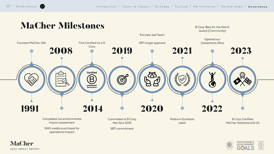
Being a part of the MaCher team creating the 2023 Impact Report was a highlight in my design journey. Not only was this the first formal design agency that I’ve worked with, itwas also my first time working with extensive data visualization. If I’m being completely honest, I don’t think that I would change a thing in my project, as the result was 100% the one that I had hoped for. However, if I were to do this project all over again, I think that I would experiment even more with the graphical representations of data. There was a lot of exploration that happened over three weeks, so I’m confident that having another week or two would have yielded some interesting results. Regardless, this is the kind of immersion therapy that I tend to thrive in when designing, and I loved every second of it!


.png)
.png)

.png)